C04:HTMLコーディング
公開日:2019年07月13日
グループ構成図を元にHTMLとCSSをコーディングします。
トップページ完成コード
HTML
<!DOCTYPE html>
<html lang="ja">
<head>
  <meta charset="UTF-8">
  <meta http-equiv="X-UA-Compatible" content="IE=edge">
  <meta name="viewport" content="width=device-width,initial-scale=1">
  <title>ポートフォリオサイト</title>
  <link rel="stylesheet" type="text/css" href="style.css">
</head>
<body>
<div class="hero">
  <div class="inner">
    <div class="flex">
      <div class="flex-item logo">
        <a href="index.html">
          <img src="img/logo.png" alt="ロゴ">
        </a>
      </div><!-- .flex-item -->
      <div class="flex-item nav">
        <ul class="flex">
          <li class="flex-item">
            <a href="#">Works</a>
          </li>
          <li class="flex-item">
            <a href="archive.html">Blog</a>
          </li>
          <li class="flex-item">
            <a href="#profile">Profile</a>
          </li>
        </ul>
      </div><!-- .flex-item -->
    </div><!-- .flex -->
  </div><!-- .inner -->
</div><!-- .hero -->


<div class="works">
  <div class="inner">
    <h2 class="title">Works</h2>
    <div class="subtitle">実績</div>
    <div class="flex">
      <div class="flex-item">
        <a href="#">
          <div class="image">
            <img src="img/thumbnail.jpg" alt="実績タイトル">
          </div>
          <div class="item-title">おすすめ店舗サイト</div>
        </a>
      </div><!-- .flex-item -->
      <div class="flex-item">
        <a href="#">
          <div class="image">
            <img src="img/thumbnail.jpg" alt="実績タイトル">
          </div>
          <div class="item-title">おすすめ店舗サイト</div>
        </a>
      </div><!-- .flex-item -->
      <div class="flex-item">
        <a href="#">
          <div class="image">
            <img src="img/thumbnail.jpg" alt="実績タイトル">
          </div>
          <div class="item-title">おすすめ店舗サイト</div>
        </a>
      </div><!-- .flex-item -->
    </div><!-- .flex -->
    <div class="link">
      <a href="#">実績一覧 ></a>
    </div><!-- .link -->
  </div><!-- .inner -->
</div><!-- .works -->

<div class="blog">
  <div class="inner">
    <h2 class="title">Blog</h2>
    <div class="subtitle">ブログ</div>
    <div class="flex">
      <div class="flex-item">
        <a href="single.html">
          <div class="image">
            <img src="img/thumbnail.jpg" alt="ブログタイトル">
          </div>
          <div class="item-title">HTML基本タグ</div>
          <div class="item-text">HTMLの基本構想と記述ルールについてまとめています。</div>
          <div class="item-date">2019年05月05日</div>
        </a>
      </div><!-- .flex-item -->
    </div><!-- .flex -->
    <div class="link">
      <a href="archive.html">ブログ一覧 ></a>
    </div><!-- .link -->
  </div><!-- .inner -->
</div><!-- .blog -->

<div id="profile" class="profile">
  <div class="inner">
    <h2 class="title">Profile</h2>
    <div class="subtitle">人物</div>
    <div class="flex">
      <div class="flex-item photo">
        <img src="img/human.png" alt="YourName">
      </div><!-- .flex-item -->
      <div class="flex-item text">
        <div class="name">YourName</div>
        <div class="item-text">
          <p>
          ウェブに特化したデザイナーです。
          SEOを踏まえた正しい文法でコーディングします。お客様にはショップオーナー様、企業のホームページ担当者様、また制作会社様など様々です。
          </p>
          <p>
          ウェブサイトに関することはお気軽にご相談ください。
          </p>
        </div><!-- .item-text -->
      </div><!-- .flex-item -->
    </div><!-- .flex -->
  </div><!-- .inner -->
</div><!-- .profile -->

<div class="footer">
  <div class="inner">
    <div class="copyright">
      © 2019 ポートフォリオ.
    </div><!-- .copyright -->
  </div><!-- .inner -->
</div><!-- .footer -->

</body>
</html>
CSS
/*********************************
 外部ファイルの読み込み
**********************************/
/* FontAwesome 読み込み */
@import url(https://use.fontawesome.com/releases/v5.8.2/css/all.css);
/* WebFont 読み込み */

/*********************************
 グループ構成確認用
**********************************/
/*
div {
  border: solid;
  margin: 20px;
}
*/

/*********************************
 共通デザイン
**********************************/
body {
  background-color: #eee;
  color: #000;
  font-family: -apple-system, BlinkMacSystemFont, "Helvetica Neue", YuGothic, "ヒラギノ角ゴ ProN W3", Hiragino Kaku Gothic ProN, Arial, "メイリオ", Meiryo, sans-serif;
  line-height: 1.6;
  margin: 0;
}

/* 見出し */
h1 {
  clear: both;
}
h2 {
  clear: both;
}
h3 {
  clear: both;
}
h4 {
  clear: both;
}
h5 {
  clear: both;
}
h6 {
  clear: both;
}

/* 文章 */
p {

}
blockquote {
  background-color: #bfeacf;
  padding: 20px 30px;
  margin: 1em 0.5em;
}

/* リスト */
ul {

}
ol {

}
li {

}
dl {

}
dt {

}
dd {
  margin-left: 0;
}

/* テーブル */
table {
  border-collapse: collapse;
  border: solid 1px #000;
}
th {
  border: solid 1px #000;
  background-color: #3b6;
  color: #fff;
  padding: 10px;
}
td {
  border: solid 1px #000;
  background-color: #fff;
  color: #333;
  padding: 10px;
}

/* 画像 */
img {
  vertical-align: bottom;
  /* 親要素の幅を最大幅とする */
  max-width: 100%;
  /* 幅が縮小された時高さを自動計算して縦横比を維持 */
  height: auto;
}

/* リンク */
a {
  text-decoration: none;
}
a:hover {
  text-decoration: underline;
}

/* clearfix */
.clearfix::after {
  content: '';
  display: block;
  clear: both;
}

/* 画像回り込み */
.img-left {
  float: left;
  margin: 0 20px 20px 0;
}
.img-right {
  float: right;
  margin: 0 0 20px 20px;
}
.img-center {
  text-align: center;
}
.clear {
  clear: both;
}


/*********************************
 コンテンツ領域
**********************************/
body {
  /* 最小幅の指定:
  横スクロールバーが出たときに背景色が切れてしまうのを阻止する
  innerで指定した幅より大きい数値
  */
  min-width: 960px;
}
.inner {
  width: 960px;
  margin: 0 auto;
}

/*********************************
 hero
**********************************/
.hero {
  background-image:
    url(img/hero_bottom.png),/* 前面 */
    url(img/hero_bg.jpg);/* 背面 */
  background-repeat:
    no-repeat,
    no-repeat;
  background-position:
    center bottom,
    center;
  background-size:
    100% 100px,
    cover;
  height: 800px;
}
.hero .inner {
  background-image: url(img/hero_text.png);
  background-repeat: no-repeat;
  background-position: center;
  height: 100%;
}
.hero .flex {
  display: flex;
  justify-content: space-between;
}
.hero .logo {
  width: 50%;
  box-sizing: border-box;
  padding: 10px;
}
.hero .nav {
  width: 50%;
  box-sizing: border-box;
}
.hero .nav ul {
  display: flex;
  justify-content: flex-end;
  list-style: none;
  padding-left: 0;
}
.hero .nav li {
  padding: 0 1em;
}
.hero .nav a {
  color: #fff;
}

/*********************************
 header
**********************************/
.header .inner {
  background-image: url(img/header_bg.png);
  height: 155px;
}
.header .flex {
  display: flex;
  justify-content: space-between;
}
.header .logo {
  width: 50%;
  box-sizing: border-box;
  padding: 10px;
}
.header .nav {
  width: 50%;
  box-sizing: border-box;
}
.header .nav ul {
  display: flex;
  justify-content: flex-end;
  list-style: none;
  padding-left: 0;
}
.header .nav li {
  padding: 0 1em;
}
.header .nav a {
  color: #fff;
}
.header .searchform {
  text-align: right;
  padding: 0 1em;
}
.header .screen-reader-text {
  display: none;
}
.header input[type="text"] {
  padding: 4px;
}

/*********************************
 footer
**********************************/
.footer {
  background-color: #000;
  color: #fff;
  padding: 40px 0 10px;
  margin-top: 150px;
}
.footer .copyright {
  text-align: center;
}


/*********************************
 works
**********************************/
.works .title {
  font-size: 60px;
  font-weight: 400;
  margin: 0;
  padding: 1em 0 0;
}
.works .subtitle {
  font-size: 24px;
  padding: 0 0 2em;
}
.works .flex {
  display: flex;
  flex-wrap: wrap;
}
.works .flex-item {
  width: 300px;
  box-sizing: border-box;
  margin-right: 30px;
  margin-bottom: 30px;
}
/*
.works .flex-item:last-child {
  margin-right: 0;
}
*/
.works .flex-item:nth-child(3n) {
  margin-right: 0;
}
.works .flex-item a {
  display: block;
  color: #333;
}
.works .flex-item a:hover {
  text-decoration: none;
  opacity: .8;
}
.works .item-title {
  color: green;
  font-size: 18px;
  font-weight: bold;
  margin: 1em 0;
}
.works .link {
  text-align: right;
  padding: 30px 0;
}
.works .link a {
  font-size: 24px;
  color: #000;
  text-align: right;
}

/*********************************
 blog
**********************************/
.blog .title {
  font-size: 60px;
  font-weight: 400;
  margin: 0;
  padding: 1em 0 0;
}
.blog .subtitle {
  font-size: 24px;
  padding: 0 0 2em;
}
.blog .flex {
  display: flex;
  flex-wrap: wrap;
}
.blog .flex-item {
  width: 300px;
  box-sizing: border-box;
  margin-right: 30px;
  margin-bottom: 30px;
}
.blog .flex-item a {
  display: block;
  color: #333;
}
.blog .flex-item a:hover {
  text-decoration: none;
  opacity: .8;
}
/*
.blog .flex-item:last-child {
  margin-right: 0;
}
*/
.blog .flex-item:nth-child(3n) {
  margin-right: 0;
}
.blog .item-title {
  color: green;
  font-size: 18px;
  font-weight: bold;
  margin: 1em 0;
}
.blog .item-text {
  font-size: 18px;
  margin: 1em 0;
}
.blog .item-date {
  font-size: 14px;
  margin: 1em 0;
}
.blog .link {
  text-align: right;
  padding: 30px 0;
}
.blog .link a {
  font-size: 24px;
  color: #000;
  text-align: right;
}

/*********************************
 profile
**********************************/
.profile .title {
  font-size: 60px;
  margin: 0;
  padding: 1em 0 0;
}
.profile .subtitle {
  font-size: 24px;
  padding: 0 0 2em;
}
.profile .flex {
  display: flex;
}
.profile .photo {
  width: 300px;
  box-sizing: border-box;
  margin-right: 30px;
}
.profile .text {
  width: 630px;
  box-sizing: border-box;
}
.profile .name {
  font-size: 24px;
  font-weight: bold;
}
.profile .item-text {
  font-size: 18px;
}
基本
HTML
<!DOCTYPE html>
<html lang="ja">
<head>
  <meta charset="UTF-8">
  <meta http-equiv="X-UA-Compatible" content="IE=edge">
  <meta name="viewport" content="width=device-width,initial-scale=1">
  <title>ポートフォリオサイト</title>
  <link rel="stylesheet" type="text/css" href="style.css">
</head>
<body>

</body>
</html>
CSS
/*********************************
 外部ファイルの読み込み
**********************************/
/* FontAwesome 読み込み */
@import url(https://use.fontawesome.com/releases/v5.8.2/css/all.css);
/* WebFont 読み込み */

/*********************************
 グループ構成確認用
**********************************/
/*
div {
  border: solid;
  margin: 20px;
}
*/

/*********************************
 共通デザイン
**********************************/
body {
  background-color: #eee;
  color: #000;
  font-family: -apple-system, BlinkMacSystemFont, "Helvetica Neue", YuGothic, "ヒラギノ角ゴ ProN W3", Hiragino Kaku Gothic ProN, Arial, "メイリオ", Meiryo, sans-serif;
  line-height: 1.6;
  margin: 0;
}

/* 見出し */
h1 {
  clear: both;
}
h2 {
  clear: both;
}
h3 {
  clear: both;
}
h4 {
  clear: both;
}
h5 {
  clear: both;
}
h6 {
  clear: both;
}

/* 文章 */
p {

}
blockquote {
  background-color: #bfeacf;
  padding: 20px 30px;
  margin: 1em 0.5em;
}

/* リスト */
ul {

}
ol {

}
li {

}
dl {

}
dt {

}
dd {
  margin-left: 0;
}

/* テーブル */
table {
  border-collapse: collapse;
  border: solid 1px #000;
}
th {
  border: solid 1px #000;
  background-color: #3b6;
  color: #fff;
  padding: 10px;
}
td {
  border: solid 1px #000;
  background-color: #fff;
  color: #333;
  padding: 10px;
}

/* 画像 */
img {
  vertical-align: bottom;
  /* 親要素の幅を最大幅とする */
  max-width: 100%;
  /* 幅が縮小された時高さを自動計算して縦横比を維持 */
  height: auto;
}

/* リンク */
a {
  text-decoration: none;
}
a:hover {
  text-decoration: underline;
}

/* clearfix */
.clearfix::after {
  content: '';
  display: block;
  clear: both;
}

/* 画像回り込み */
.img-left {
  float: left;
  margin: 0 20px 20px 0;
}
.img-right {
  float: right;
  margin: 0 0 20px 20px;
}
.img-center {
  text-align: center;
}
.clear {
  clear: both;
}


/*********************************
 コンテンツ領域
**********************************/
body {
  /* 最小幅の指定:
  横スクロールバーが出たときに背景色が切れてしまうのを阻止する
  innerで指定した幅より大きい数値
  */
  min-width: 960px;
}
.inner {
  width: 960px;
  margin: 0 auto;
}
トップページ:index.html
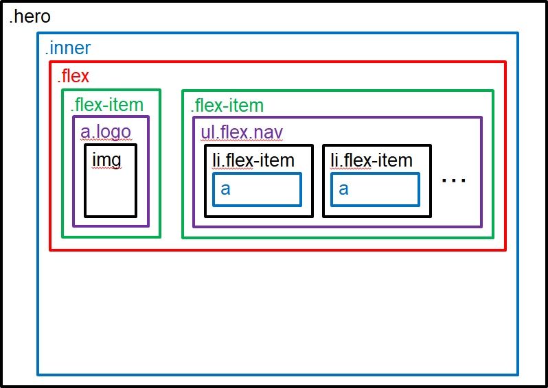
Heroパーツ
グループ構成図
HTML
<div class="hero">
  <div class="inner">
    <div class="flex">
      <div class="flex-item logo">
        <a href="index.html">
          <img src="img/logo.png" alt="ロゴ">
        </a>
      </div><!-- .flex-item -->
      <div class="flex-item nav">
        <ul class="flex">
          <li class="flex-item">
            <a href="#">Works</a>
          </li>
          <li class="flex-item">
            <a href="archive.html">Blog</a>
          </li>
          <li class="flex-item">
            <a href="#profile">Profile</a>
          </li>
        </ul>
      </div><!-- .flex-item -->
    </div><!-- .flex -->
  </div><!-- .inner -->
</div><!-- .hero -->
CSS
/*********************************
 hero
**********************************/
.hero {
  background-image:
    url(img/hero_bottom.png),/* 前面 */
    url(img/hero_bg.jpg);/* 背面 */
  background-repeat:
    no-repeat,
    no-repeat;
  background-position:
    center bottom,
    center;
  background-size:
    100% 100px,
    cover;
  height: 800px;
}
.hero .inner {
  background-image: url(img/hero_text.png);
  background-repeat: no-repeat;
  background-position: center;
  height: 100%;
}
.hero .flex {
  display: flex;
  justify-content: space-between;
}
.hero .logo {
  width: 50%;
  box-sizing: border-box;
  padding: 10px;
}
.hero .nav {
  width: 50%;
  box-sizing: border-box;
}
.hero .nav ul {
  display: flex;
  justify-content: flex-end;
  list-style: none;
  padding-left: 0;
}
.hero .nav li {
  padding: 0 1em;
}
.hero .nav a {
  color: #fff;
}
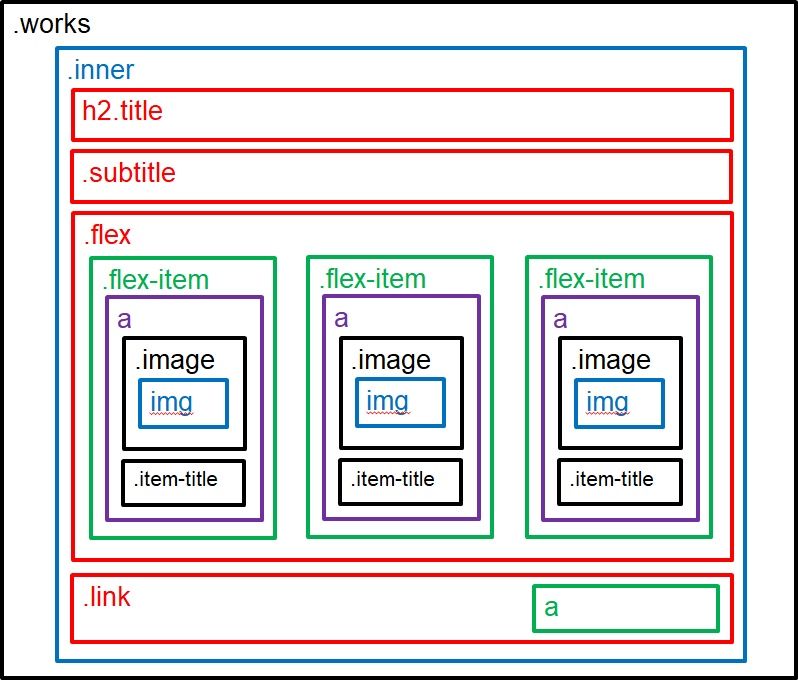
実績一覧パーツ
グループ構成図
HTML
<div class="works">
  <div class="inner">
    <h2 class="title">Works</h2>
    <div class="subtitle">実績</div>
    <div class="flex">
      <div class="flex-item">
        <a href="#">
          <div class="image">
            <img src="img/thumbnail.jpg" alt="実績タイトル">
          </div>
          <div class="item-title">おすすめ店舗サイト</div>
        </a>
      </div><!-- .flex-item -->
      <div class="flex-item">
        <a href="#">
          <div class="image">
            <img src="img/thumbnail.jpg" alt="実績タイトル">
          </div>
          <div class="item-title">おすすめ店舗サイト</div>
        </a>
      </div><!-- .flex-item -->
      <div class="flex-item">
        <a href="#">
          <div class="image">
            <img src="img/thumbnail.jpg" alt="実績タイトル">
          </div>
          <div class="item-title">おすすめ店舗サイト</div>
        </a>
      </div><!-- .flex-item -->
    </div><!-- .flex -->
    <div class="link">
      <a href="#">実績一覧 ></a>
    </div><!-- .link -->
  </div><!-- .inner -->
</div><!-- .works -->
CSS
/*********************************
 works
**********************************/
.works .title {
  font-size: 60px;
  font-weight: 400;
  margin: 0;
  padding: 1em 0 0;
}
.works .subtitle {
  font-size: 24px;
  padding: 0 0 2em;
}
.works .flex {
  display: flex;
  flex-wrap: wrap;
}
.works .flex-item {
  width: 300px;
  box-sizing: border-box;
  margin-right: 30px;
  margin-bottom: 30px;
}
/*
.works .flex-item:last-child {
  margin-right: 0;
}
*/
.works .flex-item:nth-child(3n) {
  margin-right: 0;
}
.works .flex-item a {
  display: block;
  color: #333;
}
.works .flex-item a:hover {
  text-decoration: none;
  opacity: .8;
}
.works .item-title {
  color: green;
  font-size: 18px;
  font-weight: bold;
  margin: 1em 0;
}
.works .link {
  text-align: right;
  padding: 30px 0;
}
.works .link a {
  font-size: 24px;
  color: #000;
  text-align: right;
}
ブログ一覧パーツ
グループ構成図
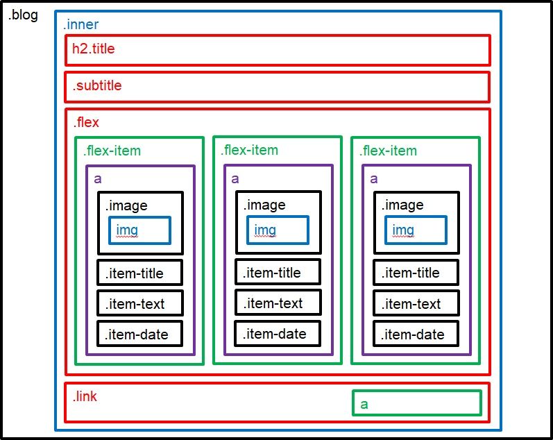
HTML
<div class="blog">
  <div class="inner">
    <h2 class="title">Blog</h2>
    <div class="subtitle">ブログ</div>
    <div class="flex">
      <div class="flex-item">
        <a href="post.html">
          <div class="image">
            <img src="img/thumbnail.jpg" alt="ブログタイトル">
          </div>
          <div class="item-title">HTML基本タグ</div>
          <div class="item-text">HTMLの基本構想と記述ルールについてまとめています。</div>
          <div class="item-date">2019年05月05日</div>
        </a>
      </div><!-- .flex-item -->
    </div><!-- .flex -->
    <div class="link">
      <a href="archive.html">ブログ一覧 ></a>
    </div><!-- .link -->
  </div><!-- .inner -->
</div><!-- .blog -->
CSS
/*********************************
 blog
**********************************/
.blog .title {
  font-size: 60px;
  font-weight: 400;
  margin: 0;
  padding: 1em 0 0;
}
.blog .subtitle {
  font-size: 24px;
  padding: 0 0 2em;
}
.blog .flex {
  display: flex;
  flex-wrap: wrap;
}
.blog .flex-item {
  width: 300px;
  box-sizing: border-box;
  margin-right: 30px;
  margin-bottom: 30px;
}
.blog .flex-item a {
  display: block;
  color: #333;
}
.blog .flex-item a:hover {
  text-decoration: none;
  opacity: .8;
}
/*
.blog .flex-item:last-child {
  margin-right: 0;
}
*/
.blog .flex-item:nth-child(3n) {
  margin-right: 0;
}
.blog .item-title {
  color: green;
  font-size: 18px;
  font-weight: bold;
  margin: 1em 0;
}
.blog .item-text {
  font-size: 18px;
  margin: 1em 0;
}
.blog .item-date {
  font-size: 14px;
  margin: 1em 0;
}
.blog .link {
  text-align: right;
  padding: 30px 0;
}
.blog .link a {
  font-size: 24px;
  color: #000;
  text-align: right;
}
プロフィールパーツ
グループ構成図

HTML
<div id="profile" class="profile">
  <div class="inner">
    <h2 class="title">Profile</h2>
    <div class="subtitle">人物</div>
    <div class="flex">
      <div class="flex-item photo">
        <img src="img/human.png" alt="YourName">
      </div><!-- .flex-item -->
      <div class="flex-item text">
        <div class="name">YourName</div>
        <div class="item-text">
          <p>
          ウェブに特化したデザイナーです。
          SEOを踏まえた正しい文法でコーディングします。お客様にはショップオーナー様、企業のホームページ担当者様、また制作会社様など様々です。
          </p>
          <p>
          ウェブサイトに関することはお気軽にご相談ください。
          </p>
        </div><!-- .item-text -->
      </div><!-- .flex-item -->
    </div><!-- .flex -->
  </div><!-- .inner -->
</div><!-- .profile -->
CSS
/*********************************
 profile
**********************************/
.profile .title {
  font-size: 60px;
  margin: 0;
  padding: 1em 0 0;
}
.profile .subtitle {
  font-size: 24px;
  padding: 0 0 2em;
}
.profile .flex {
  display: flex;
}
.profile .photo {
  width: 300px;
  box-sizing: border-box;
  margin-right: 30px;
}
.profile .text {
  width: 630px;
  box-sizing: border-box;
}
.profile .name {
  font-size: 24px;
  font-weight: bold;
}
.profile .item-text {
  font-size: 18px;
}
フッターパーツ
グループ構成図
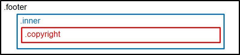
HTML
<div class="footer">
  <div class="inner">
    <div class="copyright">
      © 2019 ポートフォリオ.
    </div><!-- .copyright -->
  </div><!-- .inner -->
</div><!-- .footer -->
CSS
/*********************************
 footer
**********************************/
.footer {
  background-color: #000;
  color: #fff;
  padding: 40px 0 10px;
  margin-top: 150px;
}
.footer .copyright {
  text-align: center;
}
同じカテゴリーのコンテンツ


